12 Expert Tips to Build a High-Converting Ecommerce Landing Page


I'm looking for...
Want to turn more visitors into buyers? In this guide, I’ll show you exactly how to build a high-converting ecommerce landing page that gets results in 2025.
From grabbing attention with smart headlines to using social proof and urgency the right way, you’ll learn the latest strategies that top brands are using to scale their online stores today.
Create Your Online Store in just 5 Minutes – For Free
Pick your niche, our AI builds your store, add 10 winning products and we teach you how start selling today. Start picking your niche
What You’ll Learn

Build your Shopify store in minutes, not weeks
Start dropshipping with a free AI Shopify store, automated supplier, winning products and free courses. If you don’t make at least 1 sale, we will pay you $50 for your time.
Build your free storeWhat Is An Ecommerce Landing Page?
An ecommerce landing page is a crucial component of any online store. It serves a specific purpose: to convince visitors to take a desired action.
So, whether it’s making a purchase, signing up for a newsletter, or providing their email address, the goal is to convert potential customers into actual buyers.
Unlike main store pages, ecommerce landing pages are designed to be separate and distinct. They are where visitors land from various sources such as social media, email campaigns, or search engine results. The objective is to provide a focused and targeted experience that drives conversions.
By providing a seamless and intuitive experience, an ecommerce landing page can help guide visitors through the conversion funnel, ultimately leading to more sales and happy customers. Now, let’s see what makes a great ecommerce landing page!
👉 Check out the 19 Best Strategies To Improve Your Product Page Optimization.


Different Types Of Ecommerce Landing Pages
In fact, there are different types of landing pages. Namely, an ecommerce landing page created for first-time visitors that just want to become familiar with the brand is different from a page created for existing customers.
In a nutshell, as a dropshipping store owner, you need to create different landing pages for different marketing campaigns, ranging from increasing brand awareness to turning existing customers into repeat buyers. And remember that each page has a different goal.
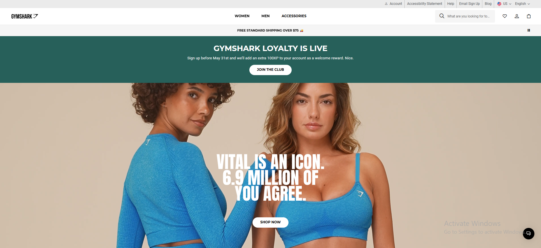
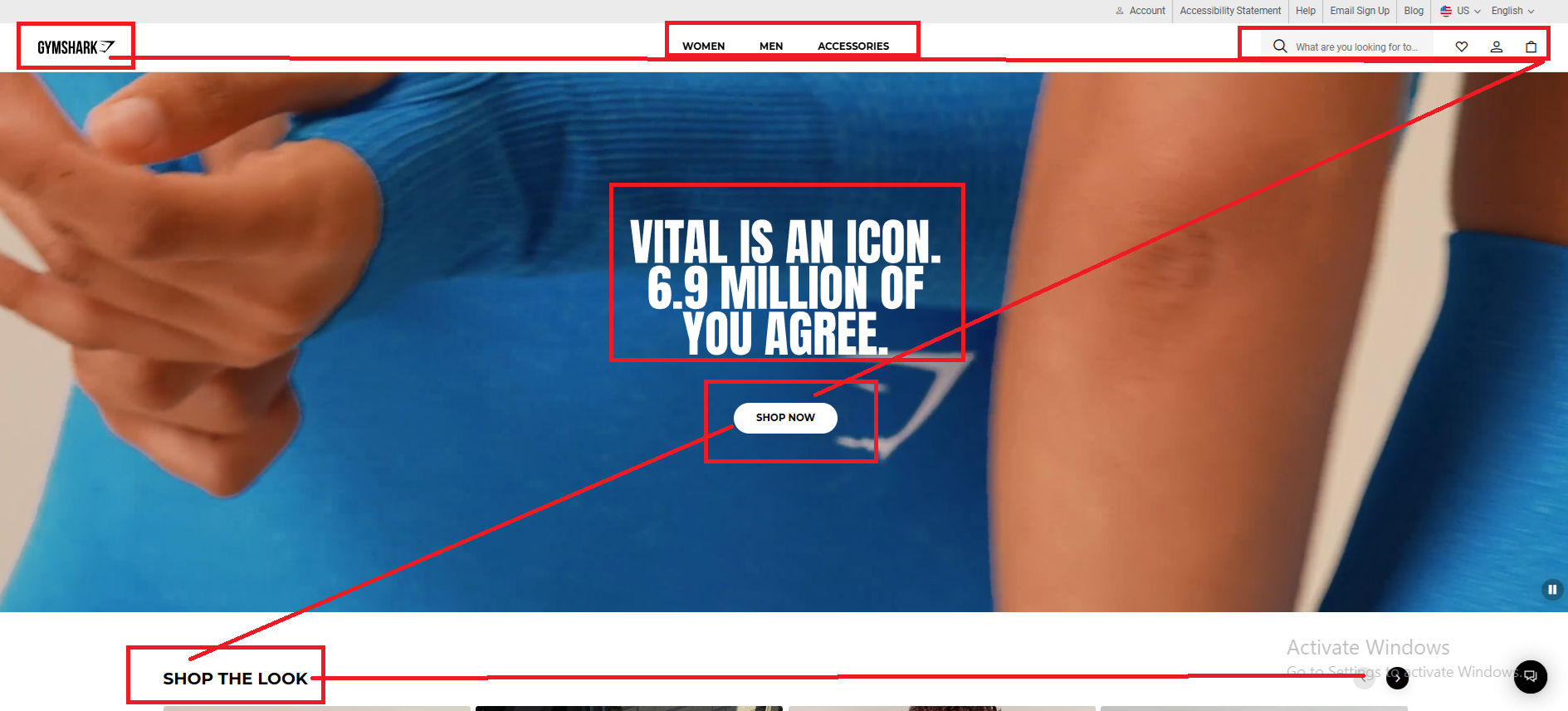
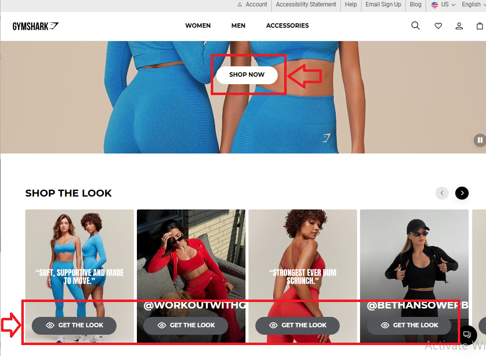
So, let’s learn what you need! Also, I will use the Gymshark website as an example to demonstrate to you the different landing pages.👇
1. Top Of Funnel Landing Page
Many dropshipping brands focus all their energy on optimizing the home page, but often, it’s a dedicated top-of-funnel landing page where customers land first.
Think of this page as your front door. It’s the first interaction a potential customer has with your brand, and as you know, first impressions matter.
Whether it’s from a social media ad, blog post, or influencer link, new visitors arrive here with zero context. So, your goal is to instantly introduce your brand, spark curiosity, and guide them to explore more.
Here’s an example of a great Top funnel landing page. The Gymshark home page has all the important elements for a high-converting home page. It combines storytelling, clear value, and clean navigation to draw new visitors in.
Hence, based on this, here’s what you should include to ensure it hits the mark:
➡ Tell Your Brand Story
Instead of diving straight into products, start by building a connection. Share why your brand exists, what makes it different, and what your mission is.
For Example:
“We started this brand to solve a real problem—finding stylish, affordable workout gear that fits every body. Welcome to [Brand Name]—where performance meets design.”
A short video or image carousel with lifestyle shots can go a long way in establishing that emotional hook.
➡ Solve a Problem, Not Just Sell a Product
Your audience isn’t looking for products—they’re looking for solutions. Use your landing page to show how your offer makes life better, easier, or more fun.
Selling posture correctors? Don’t just show the product—highlight benefits like “Relieve Back Pain While Working From Home” or “Feel Better in Just 15 Minutes a Day.”
Make the problem clear, and position your product as the answer.
➡ Build Instant Trust with Social Proof
Before buying anything, people want to know they’re not alone.
Add reviews, customer photos, media features, or even real-time order pop-ups to create that “everyone’s loving it” effect.
For Example:
🗨️ “Over 12,000 happy customers and counting!”
🌟 Rated 4.9/5 by verified buyers.
Even if you’re just starting out, show any form of validation—your TikTok following, Etsy reviews, or Instagram shoutouts.
💡 Bonus Tip: Use a clear call-to-action like “Explore Our Bestsellers” or “Find Your Fit” to gently guide new visitors into the next step—whether that’s browsing, subscribing, or learning more.
👉 Read about Testimonial Advertising: 11 Proven Examples To Sell More.
2. Mid-Funnel Landing Page
This type of landing page targets visitors who have already explored your dropshipping site but haven’t made a purchase yet. They’re aware of your brand and products, but they’re still on the fence—unsure whether your offer truly meets their needs.
A good example of a mid-funnel landing page is a feature-rich product page or a product comparison page. At this stage, your goal is to remove doubt and push the visitor closer to buying by providing value-packed information.
So, your mid-funnel page should include:
➡ Product-Focused Content
Showcase a specific product and its standout features in detail. Use clear headlines that highlight the benefits.
For example, if you’re selling a smartwatch, try a headline like:
“Smarter Fitness, Sleeker Style – Track Every Move In Real-Time.”
➡ Time-Sensitive Offers
Introduce urgency with limited-time deals. These help nudge hesitant shoppers toward faster decisions. For example:
“Claim Your 20% Discount – Offer Ends in 30 Minutes!”
Pair this with visual countdown timers to add pressure.
➡ Urgency-Driven CTA Buttons
Your calls-to-action should prompt an immediate response. Use copy like:
“Buy Now,” “Claim Your Deal,” or “Get It Before It’s Gone.”

➡ Social Proof That Builds Trust
Incorporate real testimonials, product reviews, ratings, or trust badges. Let potential buyers hear from people who’ve already made the purchase and loved it. You can also highlight your brand’s social media following or press mentions.
💡 Remember: authenticity is key—never fake social proof. Use real customer feedback and keep it ethical.
3. Bottom-Funnel Landing Page
Bottom-funnel landing pages are designed for users who have added products to their cart but haven’t checked out yet. They’re in a buying mindset, but something stopped them—maybe hesitation, distraction, or second thoughts.
Your goal here is to close the sale, eliminate final objections, and even increase order value through strategic upselling.
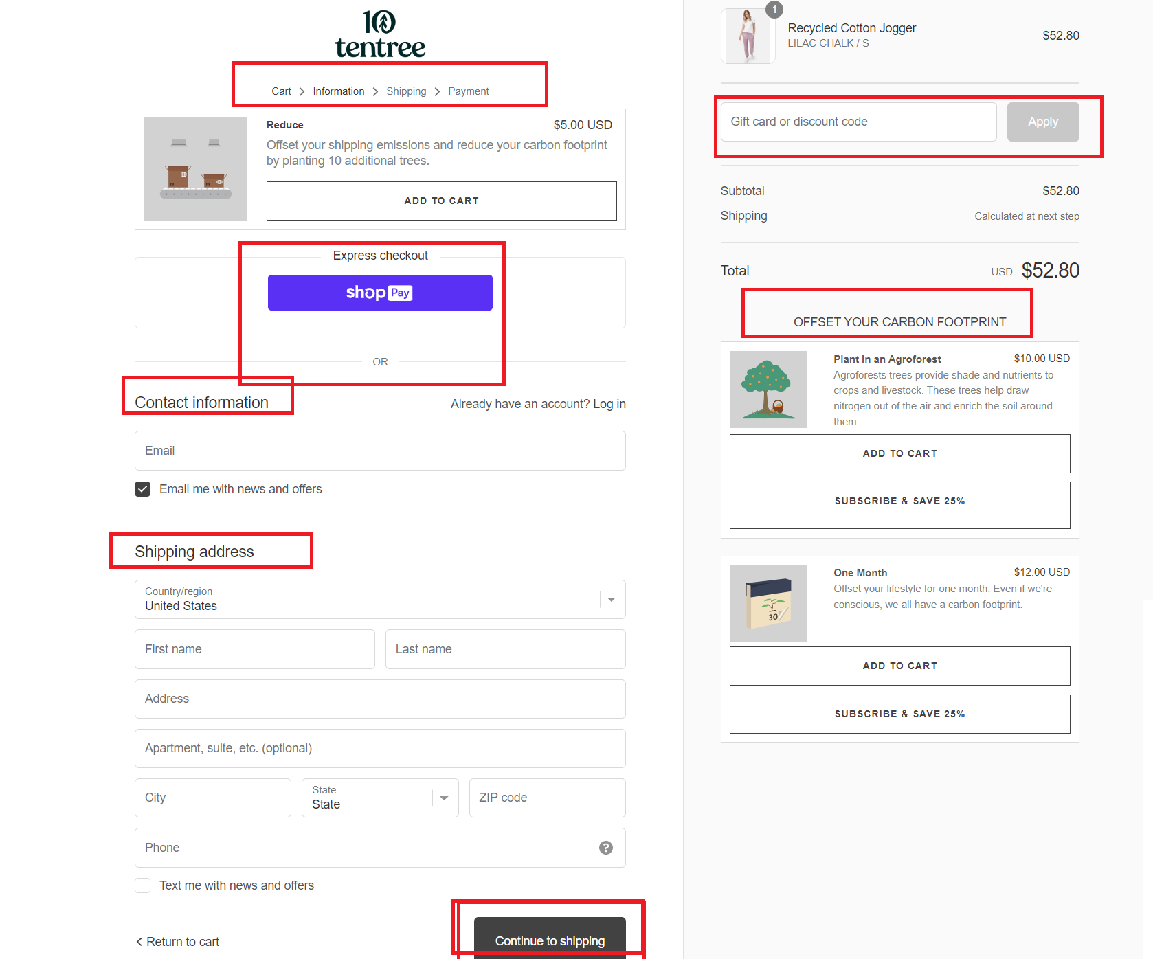
Examples of bottom-funnel landing pages include:
- Checkout optimization pages
- Cart recovery pages
- Special discount pages triggered by abandonment
Here’s what you should include:
➡ Complementary Product Suggestions
Encourage additional purchases by featuring related items. Use sections like:
“Frequently Bought Together,” “Complete the Look,” or “Customers Also Bought.”
You can even embed short blog-style content that explains how these products work well together.
➡ Bundle Offers for Extra Value
Offering bundles can increase average order value. For example:
“Buy One, Get One Free” or “Full Outfit for 25% Off When Bought Together.”
These give customers a reason to spend more while feeling like they’re getting a deal.
➡ Cart Abandonment Discounts
Combat abandoned carts with personalized incentives. Trigger popups or send follow-up emails with offers like:
“Complete Your Order and Get Free Shipping” or “10% Off If You Finish Checking Out in the Next Hour.”
💡 Tip: Shopify apps like Klaviyo or SMSBump are great for sending personalized recovery emails or SMS reminders.
➡ Strong Final CTA
Use persuasive CTA buttons that reflect urgency and reward. Phrases like:
“Make Your Order Complete,” “Finish Checkout,” or “Grab Your Deal Now”
These CTAs should appear prominently on the cart and checkout pages.
➡ Promotions
- Top-selling or best-performing dropshipping products;
- Category pages featuring products based on what your existing customers have bought previously.
- Customer loyalty, rewards, or referral programs (e.g., discount coupons and rewards);
- ➡A CTA button with something like, “Refer a Friend. Enjoy 15% Off Your Next Purchase.”
An example of this on the Gymshark website is their pages that offer an exclusive discount code, such as the Students discount and Veterans discount.
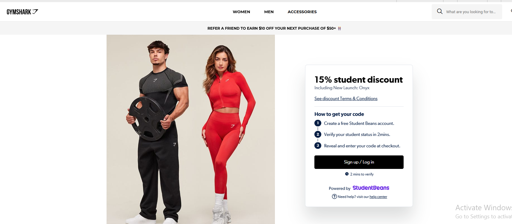
Thus, you need to strengthen your connection with them and encourage them to buy from you again.
12 Expert Tips For Designing a High-Converting Ecommerce Landing Page in 2025
Want your visitors to stop scrolling and start buying? You need more than a good-looking page.
In 2025, a high-converting ecommerce landing page must be fast, focused, and emotionally persuasive.
Whether you’re just starting out or already running Facebook and TikTok ads, here’s how to build a landing page that turns traffic into real sales:
💎 DON’T MISS: 10 Ecommerce Trends for Shopify Themes Design.
1. Create a Simple, Specific, and Powerful Headline
The very first thing visitors see is your headline—so make it count. Your headline should quickly explain what the product is and why they should care.
Keep it short and direct. You want to capture attention without making people think too hard. For example, instead of a generic line like “Welcome to Our Store,” try something like:
👉 “Get Clearer Skin in 7 Days—No Harsh Chemicals.”
That’s specific, benefit-driven, and it triggers curiosity.
You can use tools like CoSchedule Headline Analyzer to improve your headline score and test emotional impact.
2. Deliver a Message That Matches Visitor Intent
Your page should feel like a natural continuation of the ad, post, or link that brought someone there.
In other words, if someone clicks on an ad promising “the best knee brace for running,” don’t send them to a general product catalog.
Instead, make your headline and content reinforce their expectations.
You can write something like:
👉 “Run Longer Without Pain – The Brace Designed for Runners”
and follow that with images or testimonials from actual runners.
This level of consistency builds trust and reduces bounce rate instantly.
3. Use One Clear, Bold CTA Button
Your call-to-action (CTA) is the most important button on your page, so make it loud and clear. You should guide visitors toward one single next step—whether that’s “Buy Now,” “Get My Discount,” or “Add to Cart.”
If you place multiple CTAs like “Learn More” and “Subscribe” and “Shop Now,” you’re only confusing the visitor.
Use actionable language and contrasting colors. For example:
🟢 “Get 20% Off – Claim My Deal” (in a bright green button)
To help you design it, you can try Unbounce, which shows how different CTA placements perform with A/B testing.
4. Include One Clean, High-Quality Hero Image (or Short Video)
Images still speak louder than words—but only when done right.
Your landing page should feature one main hero image or short video that instantly tells the visitor what the product is and why it matters.
Instead of a plain background, show the product in use. For example, if you sell posture correctors, show a before-and-after photo of someone sitting straighter with a confident smile.
Even better? Add a 10-second UGC-style video with a real person using the product.
You can use tools like Veed.io or InVideo to create simple branded clips.
💡 Pro tip: Keep video sizes under 3MB to avoid slowing your page down.
💡 Tip: Learn How To Optimize Shopify Image Sizes In 2025 + Pro Tips.
5. Make It Mobile-First, Not Just Mobile-Friendly
Over 75% of ecommerce shoppers browse on mobile—so your landing page needs to look amazing on small screens.
What does this mean? Test your layout on mobile first. Make buttons larger, reduce clutter, and keep CTAs visible without needing to scroll too much.
Use Shopify’s theme preview tool or Google’s Mobile-Friendly Test to see exactly how your page behaves across different devices.
6. Simplify Navigation – Less is More
Don’t send people in ten different directions. Your landing page should act like a funnel, not a maze.
Avoid cluttering it with menus, extra product links, or unrelated blog posts. Instead, guide your visitor from headline to CTA with minimal friction.
A good layout follows a Z-pattern:
Top left = your logo
Top right = CTA
Middle = image and explanation
Bottom = social proof and CTA again
You can test this approach using tools like Hotjar to see where visitors click or drop off.
So, what can you do? Using clear headings, logical organization, and a user-friendly interface contribute to a positive user experience and encourage visitors to stay longer on the page.
Let’s suppose that a girl has an upcoming birthday celebration and likes to buy a new stunning dress. And she searches on Google for “Best special occasion dresses”. In the Google search results, she clicks on a link with the title “Special occasion dresses for a memorable night”.
When she lands on the page, she sees a headline that matches the ad (“It is your day to shine! You deserve a unique dress.” There are also high-quality photos of beautiful dresses on the page and a CTA button offering a promo code for a 15% discount.
And, that’s when you got yourself a potential customer!
7. Use Social Proof That Feels Real
In 2025, shoppers don’t trust big claims—they trust people.
So, add real reviews, ratings, and testimonials that feel human. If you have UGC from TikTok or Instagram, embed those directly on your page.
Example:
🗨️ “I’ve been struggling with acne for 2 years and this serum actually helped me clear it up in a week. Total game changer!”
To automate this, you can use tools like Loox or Judge.me to import photo reviews and star ratings from real customers.
8. Optimize Your Page for Speed
A slow-loading page kills conversions—period. You lose 1 in 2 users if your page takes longer than 3 seconds to load.
To avoid this:
- Compress images using TinyPNG
- Use lightweight Shopify themes like Dawn or Impulse
- Avoid heavy pop-ups and autoplay videos
You can also run your page through GTmetrix or PageSpeed Insights to get a free speed report and improvement tips.
9. Personalize the Experience
2025 is all about dynamic personalization. You can now tailor your page to the user’s location, referral source, or device.
For example:
- Show a popup that says: “Welcome back! Your last item is still in stock.”
- Or if they came from a Facebook ad, include: “Exclusive FB Offer: 15% Off Today Only!”
You can do this using personalization tools like ReConvert, LimeSpot, or Dynamic Yield.
10. Create a Sense of Urgency and Scarcity
One of the best ways to get people to act now is by using a little urgency.
You can:
- Add a countdown timer like “Only 03:27 left to get this deal.”
- Show stock levels: “Only 6 left in your size”
- Use cart timers to keep shoppers moving
Apps like Beeketing, Urgency+, or Nudgify make this easy to implement on Shopify.
11. Segment Your Pages by Traffic Source or Audience
One landing page won’t convert everyone.
So, if you’re running multiple traffic sources—say, TikTok Ads, Google Search, and abandoned cart emails—you should build different versions of the same offer for each.
For example:
- TikTok audience = short, UGC-heavy, swipe-style layout
- Google audience = feature-heavy, benefit-focused layout
- Retargeting = short offer page with urgency + testimonial
Use tools like PageFly or Shogun to easily clone and customize landing pages by audience type.
12. Keep It Distraction-Free (CTA is the Only Path Forward)
Remove all the clutter. Visitors should only have one clear path forward—your CTA.
That means:
- No homepage links
- No footer menus
- No unnecessary form fields
Every element on the page should either build desire or support the sale. If it doesn’t, cut it.
💬 Think of your landing page like a conversation:
- Headline = Hello
- Image = This is what I’m offering
- Copy = Here’s why it works
- CTA = Ready to try it?
5 High-Converting Ecommerce Landing Page Examples
My Luxurious Home
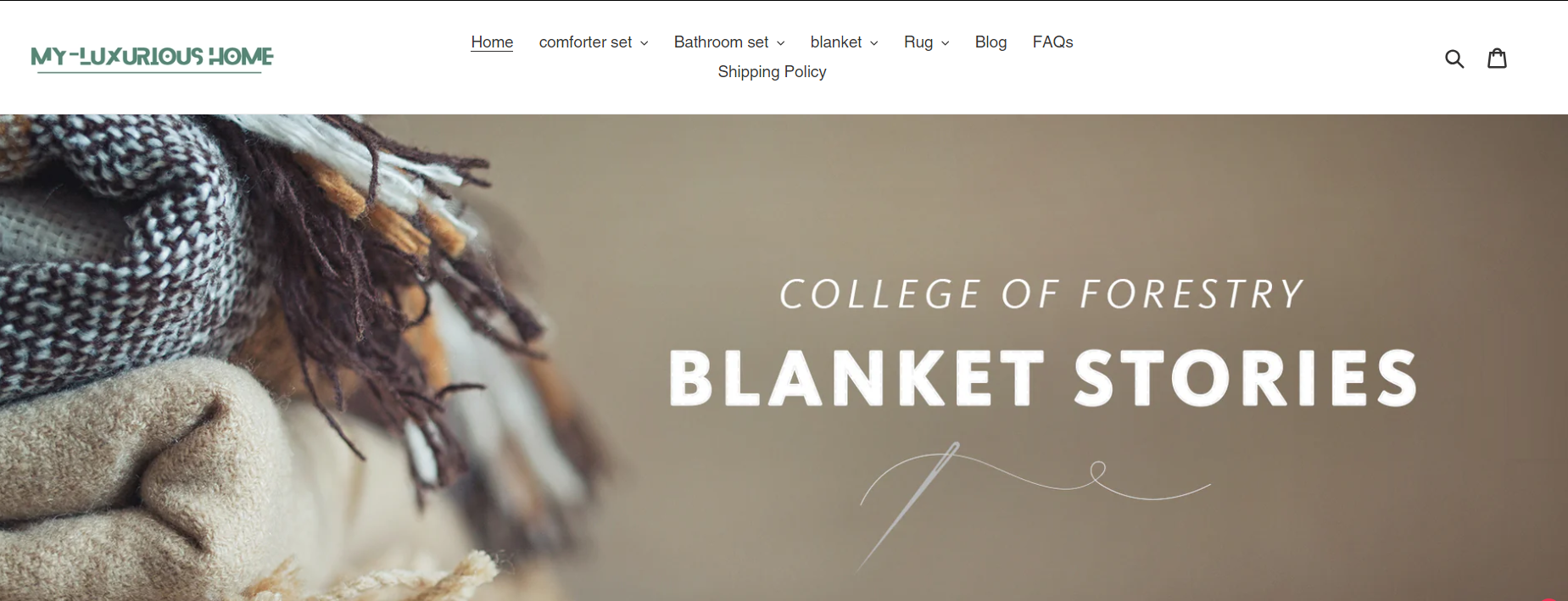
Top-Funnel: First Impressions and Branding
My Luxurious Home is a standout example of a Shopify store that focuses on upscale bedding, comforters, and home accessories. It’s known for offering stylish, comfortable, and budget-friendly home décor products that appeal to shoppers worldwide.
Upon visiting the homepage, you’re welcomed with a full-screen banner showcasing premium bedding collections. The inviting color scheme and elegant fonts evoke warmth and luxury, perfectly matching the brand’s tone.
The homepage utilizes a grid layout to feature bestsellers and create instant visual interest.
Mid-Funnel: Exploration and Education
The website features a user-friendly menu, dividing its catalog into neatly arranged categories like blankets, rugs, bathroom sets, and comforters.
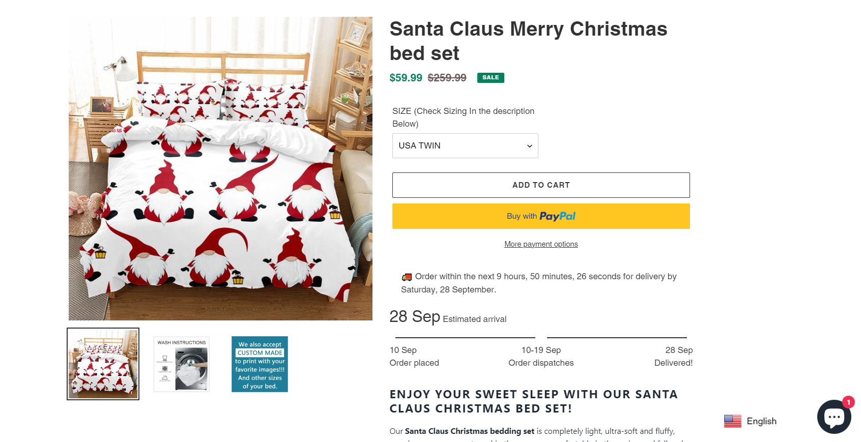
Each product page is equipped with high-quality photos, detailed specs, and verified customer reviews. Key features include:
- Size charts for selecting the right bedding fit.
- Security icons to build shopper trust.
- A related product section to increase the basket size.
Bottom-Funnel: Conversion Elements
At checkout, customers enjoy a smooth payment process with options like PayPal and credit cards. The store boosts conversions using:
- A 10% welcome discount (code: Winter25) is showcased in the header.
- An email sign-up form offering exclusive deals.
- Real-time chat support for personalized customer service.
- Product reviews and social proof to encourage confidence.
The brand integrates powerful Shopify apps, such as:
- Loox for user-generated product reviews.
- DSers to automate dropshipping logistics.
- PageFly for designing customized landing pages.
- SEOAnt to boost search rankings.
- Infinite Product Options for enhanced product variations.
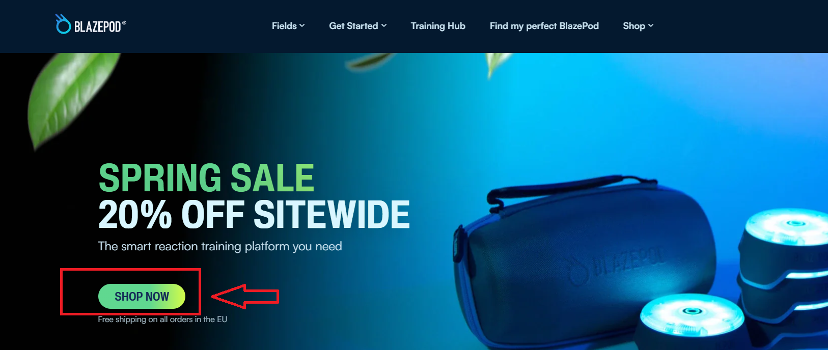
BlazePod
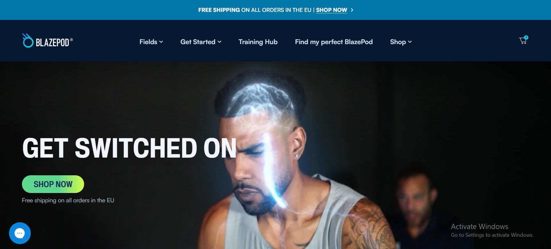
Top-Funnel: Branding and Initial Engagement
BlazePod offers innovative, light-based training tools for athletes and coaches, making it a unique entry among Shopify fitness store examples. It blends interactive tech with physical training to boost speed, focus, and agility.
The homepage grabs attention with a striking hero image of an athlete using BlazePod pods, backed by a CTA like “Activate Killer Instincts.” The dark theme and bold visuals give off a high-energy, performance-driven vibe.
Mid-Funnel: Product Exploration and Trust Building
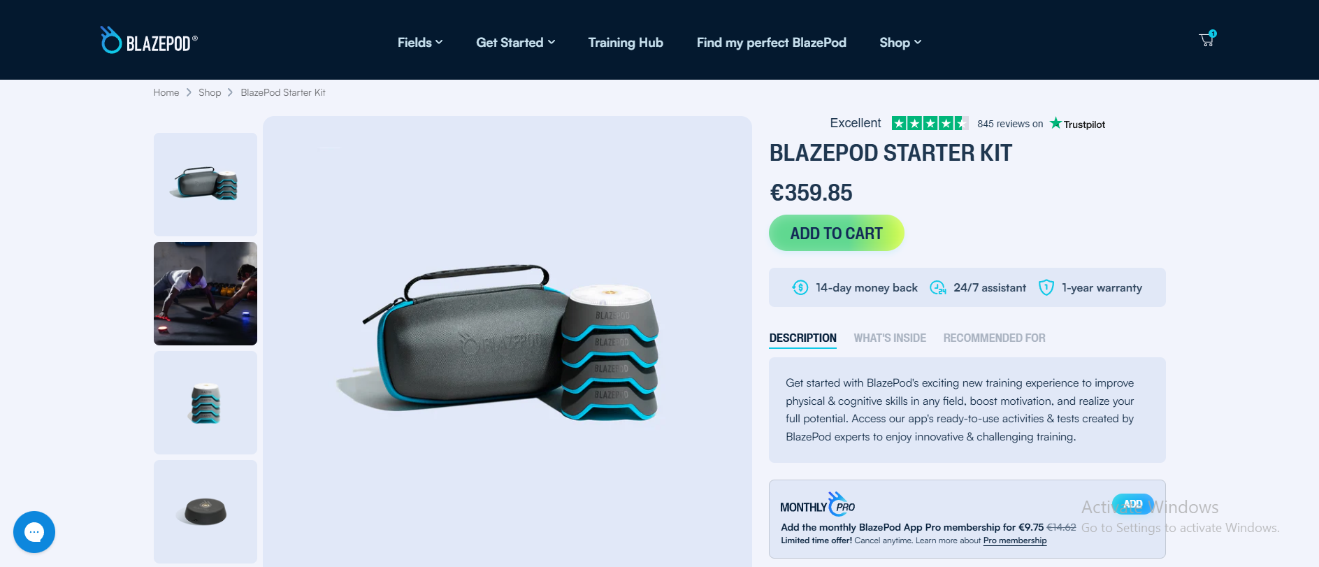
Navigation is tailored to different sports niches—football, basketball, martial arts—and features a clean layout with strong visual hierarchy. Key homepage elements include:
- Grid highlights of benefits and features.
- Video testimonials from professionals.
- Organized sections for easy browsing.
Product pages showcase:
- Demo videos and HD visuals of the pods in use.
- Detailed writeups covering performance impact and kit contents.
- Endorsements from NBA coaches and therapists to establish trust.
- A bundle selection tool for upselling.
Bottom-Funnel: Checkout and Conversion Drivers
Checkout is fast and optimized, with free shipping for EU customers and secure payment gateways. Additional tactics include:
- Homepage discounts for new users.
- Email marketing for tips, updates, and offers.
- Testimonials from sports professionals to build trust.
- Live chat support and FAQs for better service.
Apps in use:
- Loox for reviews.
- DSers for fulfillment.
- PageFly for campaign pages.
- ReConvert for post-purchase upsells.
- SEOAnt for organic reach.
Wolf Circus
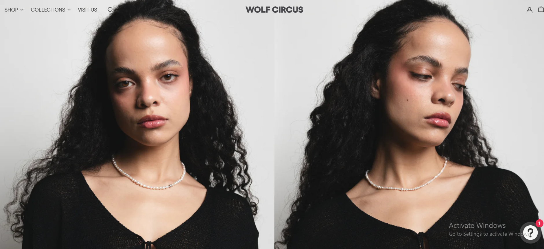
Top-Funnel: Elegant Branding and Aesthetic Appeal
Based in Vancouver, Wolf Circus creates handcrafted, demi-fine jewelry and presents an ideal Shopify DTC model that can inspire high-end dropshipping businesses.
The site is minimalist, using white space, refined typography, and stunning photography to emphasize craftsmanship. Visitors are greeted with a premium brand atmosphere that sets the tone immediately.
Mid-Funnel: Product Education and Interaction
Each product is displayed with:
- Clear size and care instructions.
- Zoom features for close inspection.
- Seamless payment integration via Shop Pay.
The brand focuses on sustainability, highlighting the use of recycled materials and quality production.
Bottom-Funnel: Conversion Tactics and Retention
To drive sales and encourage loyalty, Wolf Circus uses:
- First-time customer discount via Klaviyo email.
- Free shipping on purchases over $150.
- Instagram, Pinterest, and TikTok for brand storytelling.
Apps enhancing the site include:
- Klaviyo for email/SMS.
- Loox for reviews.
- Boost AI Search for discovery.
- Lucky Orange for visitor behavior analysis.
- ConvertWise for cart upselling.
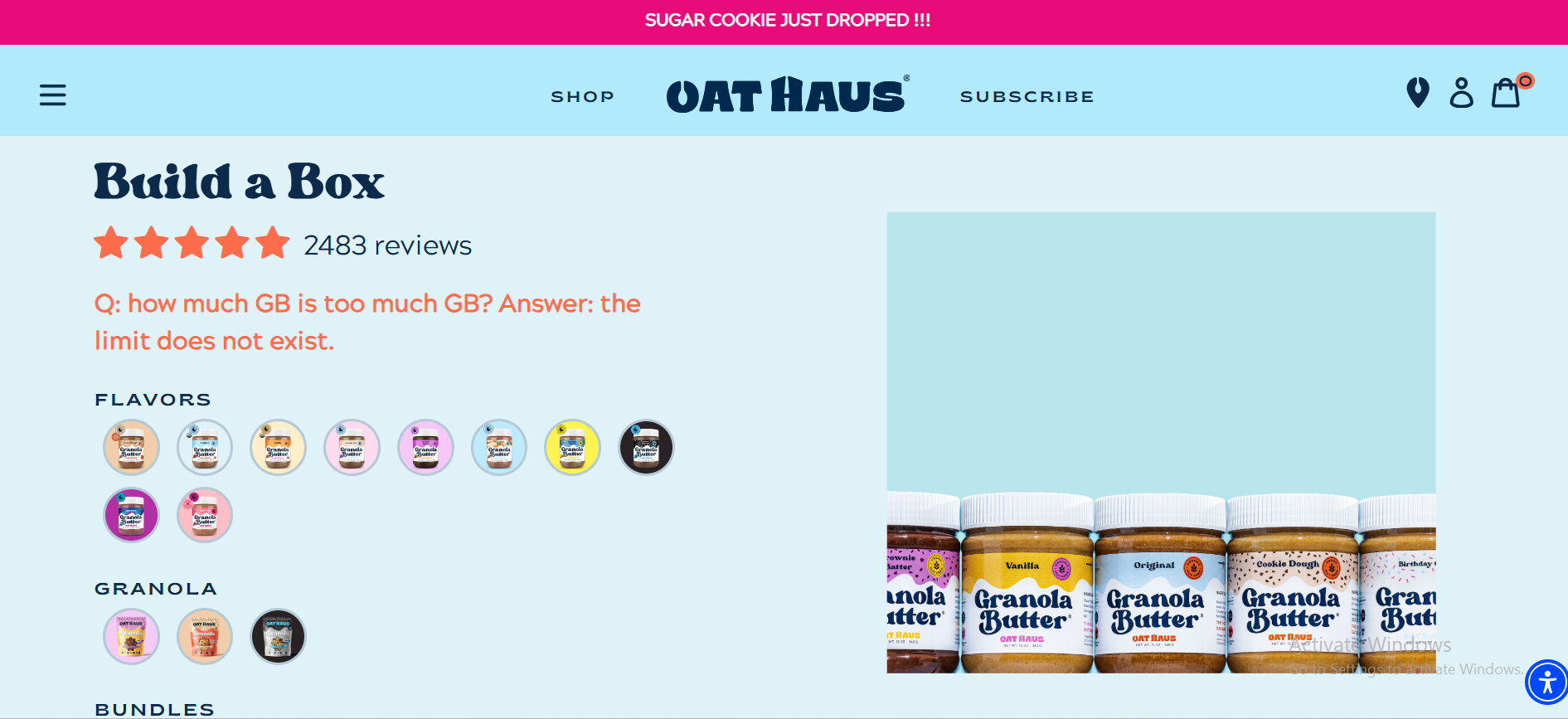
Oat Haus
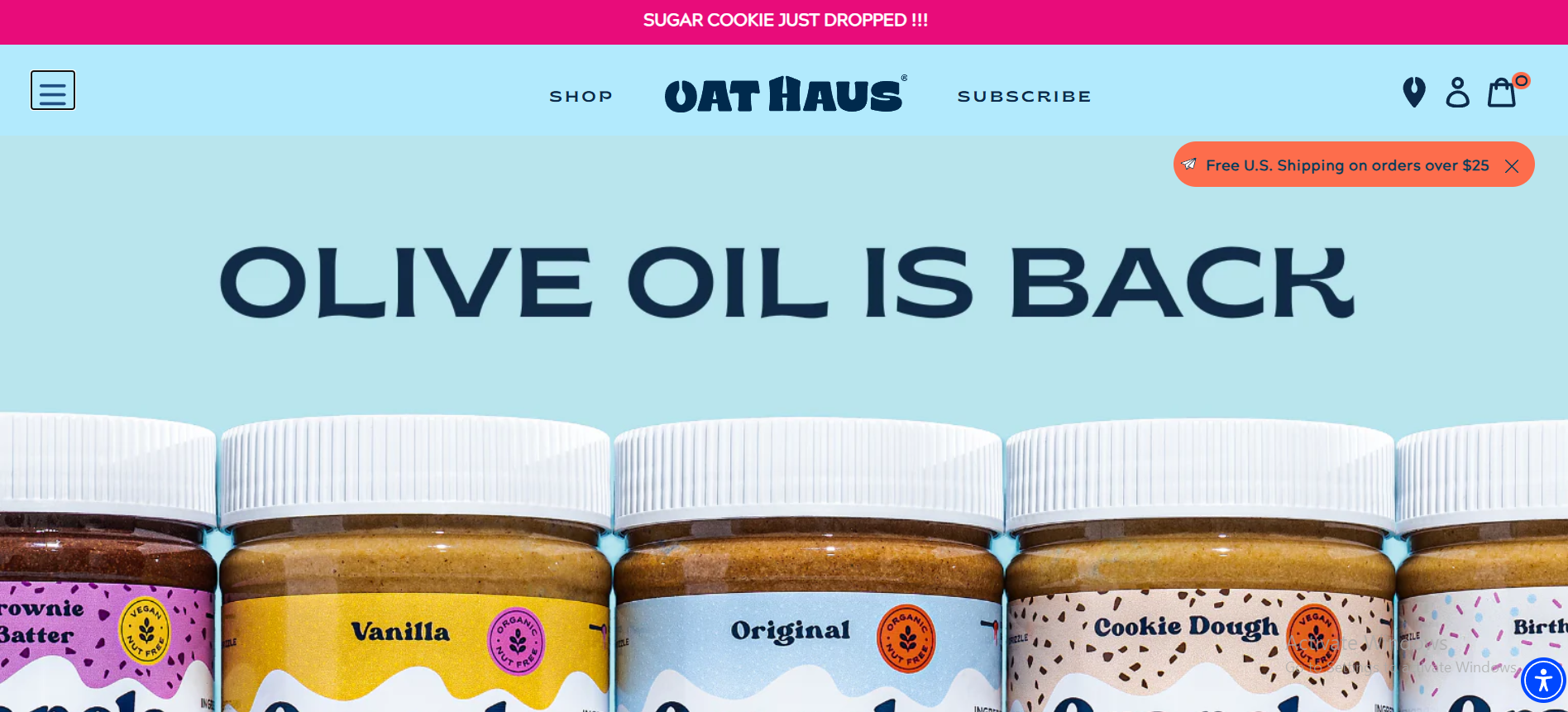
Top-Funnel: Bold Identity and Visual Appeal
Oat Haus is a Shopify store that reimagines nut butter with vibrant branding, allergen-friendly recipes, and a fun personality. Ideal for wellness-focused entrepreneurs.
With bright pastel tones and quirky fonts, the site is cheerful and inviting. Navigation is clean, with sections like Shop, Subscribe, and Learn More. The homepage conveys inclusivity, health-conscious living, and community.
Mid-Funnel: Transparency and Engagement
Product pages are rich with:
- Nutritional facts and allergy info.
- Lifestyle imagery and use-case inspiration.
- A guide to “How to Use” granola butter creatively.
The site encourages brand connection with customer testimonials, influencer collabs, and storytelling about its origins and values.
Bottom-Funnel: Conversion and Retention Focus
Checkout is streamlined and includes a subscription model for recurring deliveries. Other tactics include:
- 10% first-purchase discount for email sign-ups.
- Relatable and engaging TikTok/Instagram content.
- “Haus Party Rules” to reinforce the community.
Shopify apps used:
- Klaviyo for automation.
- Postscript for SMS re-engagement.
- Carro for influencer collabs.
- UpPromote for affiliate reach.
- UserWay to improve accessibility.
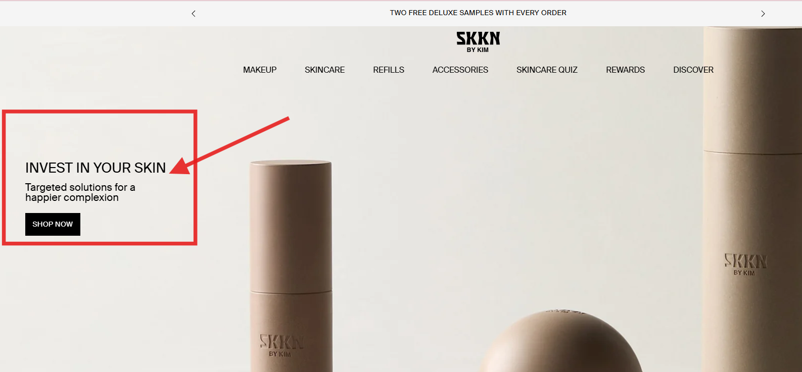
SKKN by Kim
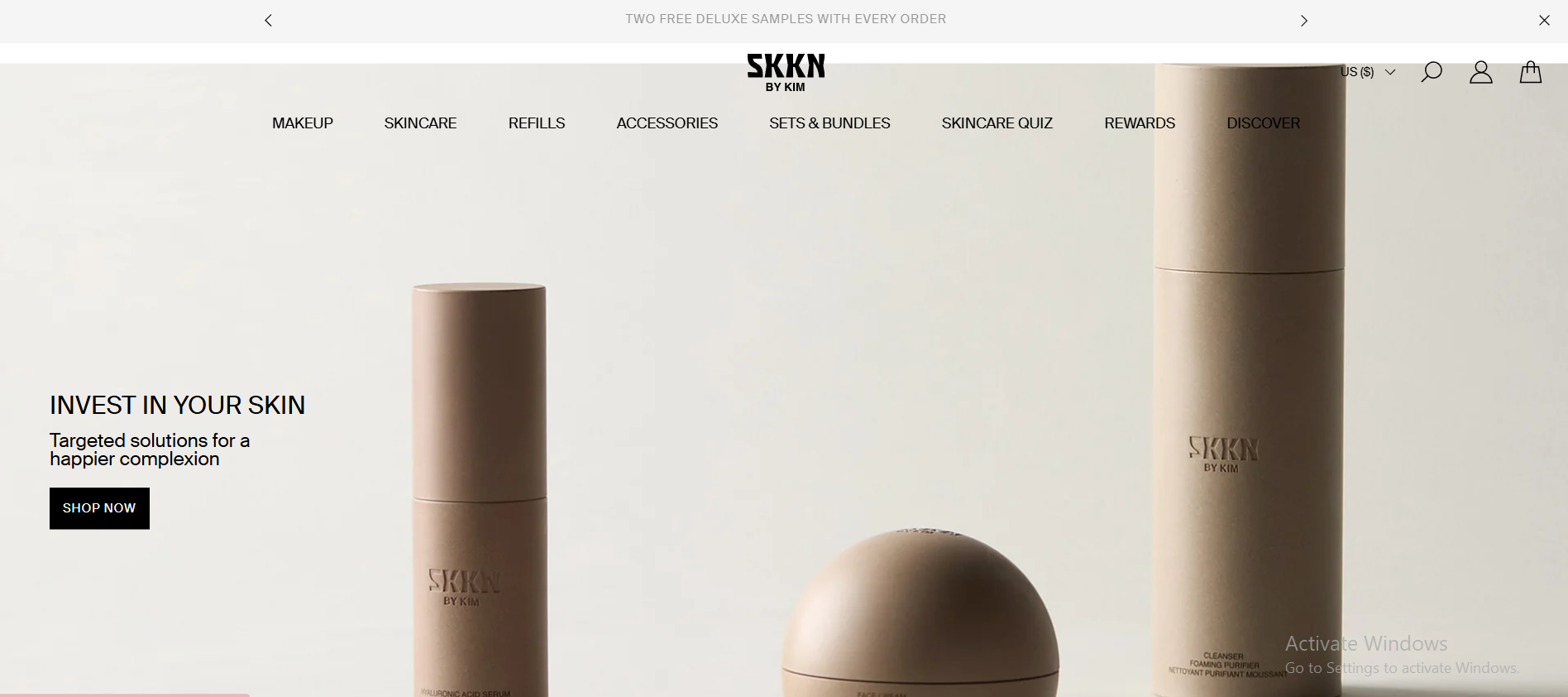
Top-Funnel: Luxury Brand Positioning
SKKN BY KIM is a high-end skincare brand using Shopify to deliver a minimalist, elegant experience backed by celebrity influence. Its homepage uses neutral colors and clean lines to reinforce premium quality.
Mid-Funnel: Deep Product Insight and Education
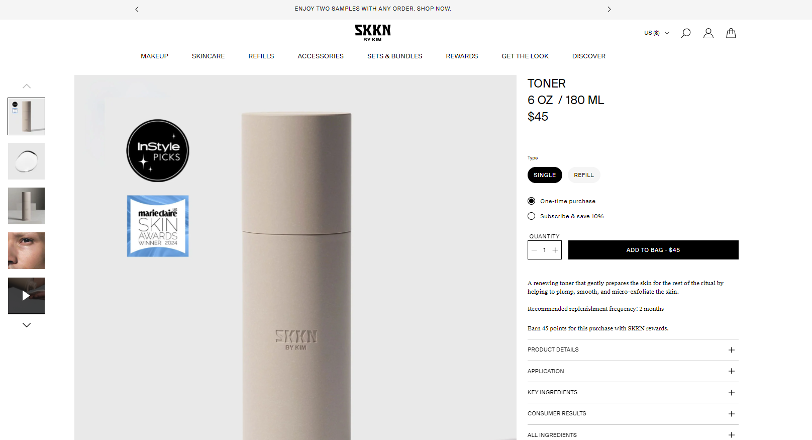
Product pages feature:
- Interactive videos and large images.
- Ingredient lists, benefits, and customer reviews.
- Options for one-time or subscription-based orders.
The layout supports informed purchasing while maintaining visual sophistication.
Bottom-Funnel: Conversion and Loyalty Systems
SKKN uses smart retention and conversion strategies such as:
- Exclusive deals for subscribers.
- Free shipping incentives.
- A rewards program to build loyalty.
- Influencer and UGC-driven “Shop The Look” features.
Apps integrated:
- Judge.me and Loox for product credibility.
- TinySEO to optimize performance.
- PushOwl for push notifications.
- TikTok Ads Manager to support paid campaigns.
Though not a dropshipping brand, SKKN BY KIM’s DTC mastery, automation tools, and high-converting UX make it a standout Shopify store blueprint.
Ecommerce Landing Page FAQs
Product pages include detailed info, reviews, specs, and SEO optimization. These serve shoppers browsing your store.
Homepages introduce your brand and guide visitors through various categories, but aren’t focused on one action.
Mid-Funnel: Focused offers like bundles or comparisons.
Bottom-of-Funnel: Use urgency, cart recovery offers, and free shipping to close the sale.
Conclusion
To summarize, your ecommerce landing page should persuade your visitors to act on an offer. In essence, there are different landing pages for different marketing campaigns.
So, you need to synchronize your landing page with your marketing campaign.
Just follow our tips and you will build a landing page that converts! Also, I hope that our examples of high-converting landing pages can stimulate your creativity and spark your imagination.
Want to learn more?
How To Find The Best Dropshipping Niche for Your Business in 2025;
Best E-commerce Platforms In 2025: How To Choose One For Your Store?
Debutify Shopify Theme Review: Is Debutify The Right Theme for Dropshipping?
How To Set Up Your First Store On Shopify [No.1 Beginners Guide].


![The Top 21 3PL Companies Compared [2025 List & Guide]](https://images.weserv.nl/?url=https://prod-dropshipping-s3.s3.fr-par.scw.cloud/2024/03/Frame-3922469.jpg&w=420&q=90&output=webp)